DIGITAL BRASILIA
| April 16, 2014
Callan Lamb works at Kickstarter, lives in Clinton Hill, and is currently working on a young adult novel. This blog has been thinking and writing a lot about technology and music and security, and we thought it would be nice to switch gears and have some ideas about technology and design represented. Lamb's view on form following function—on- and off-line—is an interesting one. I've been noticing the homogenization of culture lately—Brooklyn Bowl London is a place that exists. Go into any bar in Sweden and they'll recommend you have a Brooklyn Lager. I watched a movie recently that highlighted a suburban development outside Shanghai called "Thames Town," built to resemble the town of York or Bath. No one can afford to live there, but brides insist on having their photos taken in the neighborhood, as they've always dreamed of a wedding in a cathedral. There's something a little bit creepy and disconnected about all of this—Lamb explores similar feelings below...
I think I'm allergic to sleekness.
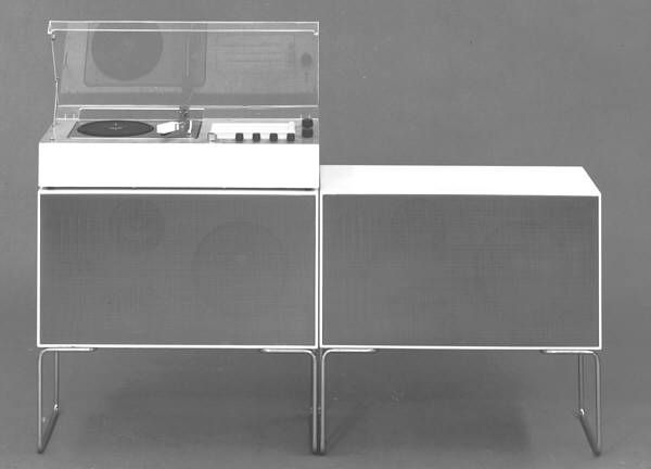
This is not a medically recognized condition—or at least not just yet—but I'm convinced of its validity. It's not just an aversion, mind you, not just an aesthetic distaste. It's an actual physiological response. I feel uncomfortable in sleek spaces, in the presence of sleek design. I can't walk through an Apple store without feeling out of place among the clean surfaces, somehow judged by the clear tables and frosted glass. Those minimalist mock rooms in Ikea feel like a trap armed with cheap meatballs, just waiting to bury me under Magnarp lamps and that shitty $400 couch you and all your friends have. Mujis may be the worst; I spent nearly half an hour at one a few months ago, staring at an impeccably arranged display of kitchenware surrounded with white space and advertising copy cast in Helvetica. As I stood there trying to figure out which spatula was the most Me, I remember being overcome with the sickeningly strong suspicion that a display case full of kitchenware and egg beaters will be what greets me when I die. (And also I ended up going with the wooden one because it seemed a bit more rustic, you know?)

Suffice it to say that 2014 isn't the best of times for someone who's not a fan of this pervasive corporate minimalism. I'm inexact and dilettantish by nature so perhaps these equivalencies are false, but everywhere I look it seems that sleekness—sleekness as an attribute to be desired, sleekness as the dominant mode of cultural production—seems to be in ascendance. Under the guise of flat design in software, Bauhaus-and-Dieter-Rams-inflected simplicity in physical products, and those godawful glass condos they're building in every empty lot and flowerbed in New York, everywhere I look I see the same kind of stripped down essentialist design before which all other creative aberrations must give way. Toasters and apps and cars and condos are designed with the same few principles in mind—a frictionless experience, an uncluttered appearance, a bare design that would always rather do too little than too much.
There is an anesthetizing effect to this kind of design, a subtlety that strikes me as problematic (and not just because I'm from Long Island and prefer all things to be as loud and obnoxious as I am). Design is lauded for its understatement and its elegance, celebrated when it recedes into the background. Technology is deemed most valuable when it is contextual and intelligent, learning a user's preferences and integrating seamlessly with their day to day. Interactions are best when they are immediate and unthinking, a la Tinder's swipe feature or Amazon's 1-click buy. Good design, apparently, functions along the lines of a minor concussion—the less you remember it happening, the better.
But far worse than any nebbish handwringing I might have over the harmful effects of too-much-convenience is the reductive quality of the logic behind this ideology. Ascendant aesthetic systems—in their uniformity and their ubiquity—speak truths about hegemony, I think, and our current embrace of efficiency and smoothness and replicability above all else seems to embody an ultimately dehumanizing logic, one in which design principles are elevated well above the people who might use these products.
The deeper implications of the philosophy behind this aesthetic ideology have already been outlined at length in an article in the New Republic by Evgeny Morozov, but it's worthwhile summarizing a few key points. Morozov highlights the following quote from design maven Jony Ive as being particularly telling of the larger philosophy underpinning the aesthetics of Apple:
“We don't like to think of our knives as being glued together. Steve and I care about things like that, which ruin the purity and detract from the essence of something like a utensil, and we think alike about how products should be made to look pure and seamless.”
As Morozov rightly points out, there is a value system implicit in this statement, one that treats products as having an essential character or 'truth' to their design that would seem to be divorced from its human uses. Ive furthers this assertion in a forward to a book on Dieter Rams, saying that, “Rams's genius lies in understanding and giving form to the very essence of an object's being—almost describing its reason for existence.” Rams's “products seem inevitable, challenging you to question whether there could possibly be a rational alternative.” The job of the designer then, becomes not to respond to market research or user testing, but to (as Morozov puts it) “uncover and to reveal—rather like scientists; for design is just a tangible, natural and objective byproduct of history.”
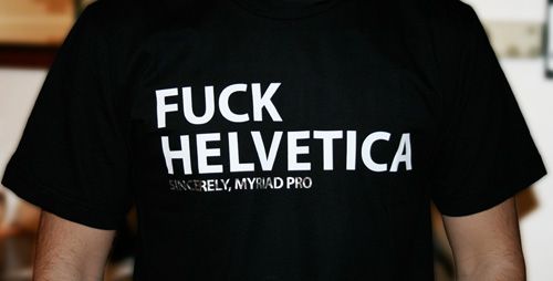
What seems problematic here is that in a design ideology beholden to the golden principle that form follows function, the human response is made immaterial. Equating “good” design with a value system that exists a priori and independent of context (with appeals to terms like essence and inevitability) removes the people who actually use products from the creative process, and closes off these aesthetic judgments to any further discussion. Aberrations—a fondness for fonts other than Helvetica, a love of lightbulbs not Edison, a color palette that extends beyond near-ubiquitous white—are thus immediately marginalized for their distance from a product's “truth.” Disagreement with the prevailing aesthetic ethos is invalidated before it can even be expressed, and slowly but surely designed products and experiences lose their multiplicity and complexity and begin to feel ever more the same.
It's dangerous equating the ethos of a single company with that of the larger world of design, but it seems as though this emphasis on first principles is something of a trend. If in products there is an emphasis on 'purity' and 'seamlessness,' in web development there are similar universalizing catch-phrases that permeate the ecosystem—less is more, content is king, mobile first. Again, these principles seem both inwardly turned and universalizing, presented as truisms and yet existing divorced from context. And although these rules are not bad ones, mind you, and help satisfy both technical requirements and the burden of scaling, an over-reliance on them can lead to a loss of locality and an unfortunate ossification in the ways in which we interact with the web. We come to assume that content—whether it be pictures or quips or blog posts—should live locked in linear infinite scrolls, surrounded with white space and punctuated occasionally with ads. Marketing pages allow for leeway in the form of high res photos and parallax, but they're mostly non-functional, existing primarily to get you to click a download link in an app store. Say what you will about the horrors of early web design, at least there wasn't a right way to make a website.
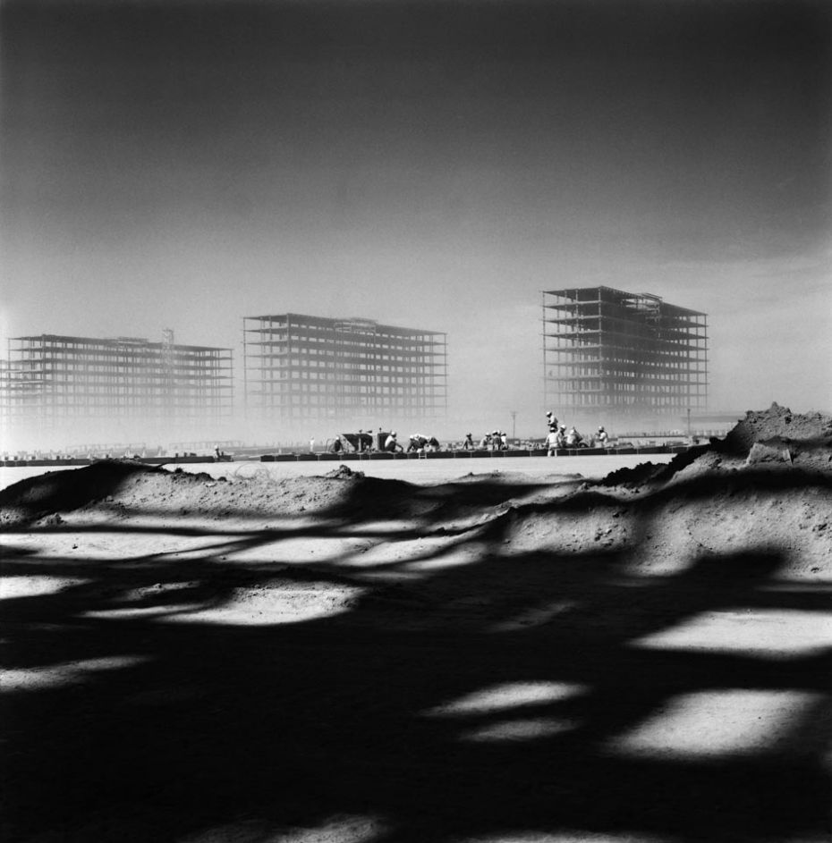
There's an absurdity inherent to this criticism, obviously—Jony Ive designs wildly successful products while I mostly spend my time rewatching Buffy the Vampire Slayer and drinking cab sav on ice. (I call it a Del Boca Vista.) The purported one hundred and fifty nine billion dollars Apple has in cash reserves is retort enough. But—regardless of current ubiquity or financial success—aesthetics have a habit of evolving, and it's interesting to look at past trends in design for examples of what can happen when an aesthetic ideology stops questioning itself and begins equating subjective opinions with objective and irrefutable proofs. Perhaps the best such example of this is the modernist architecture and urban planning of the last century, epitomized in the design and construction of the city of Brasilia.

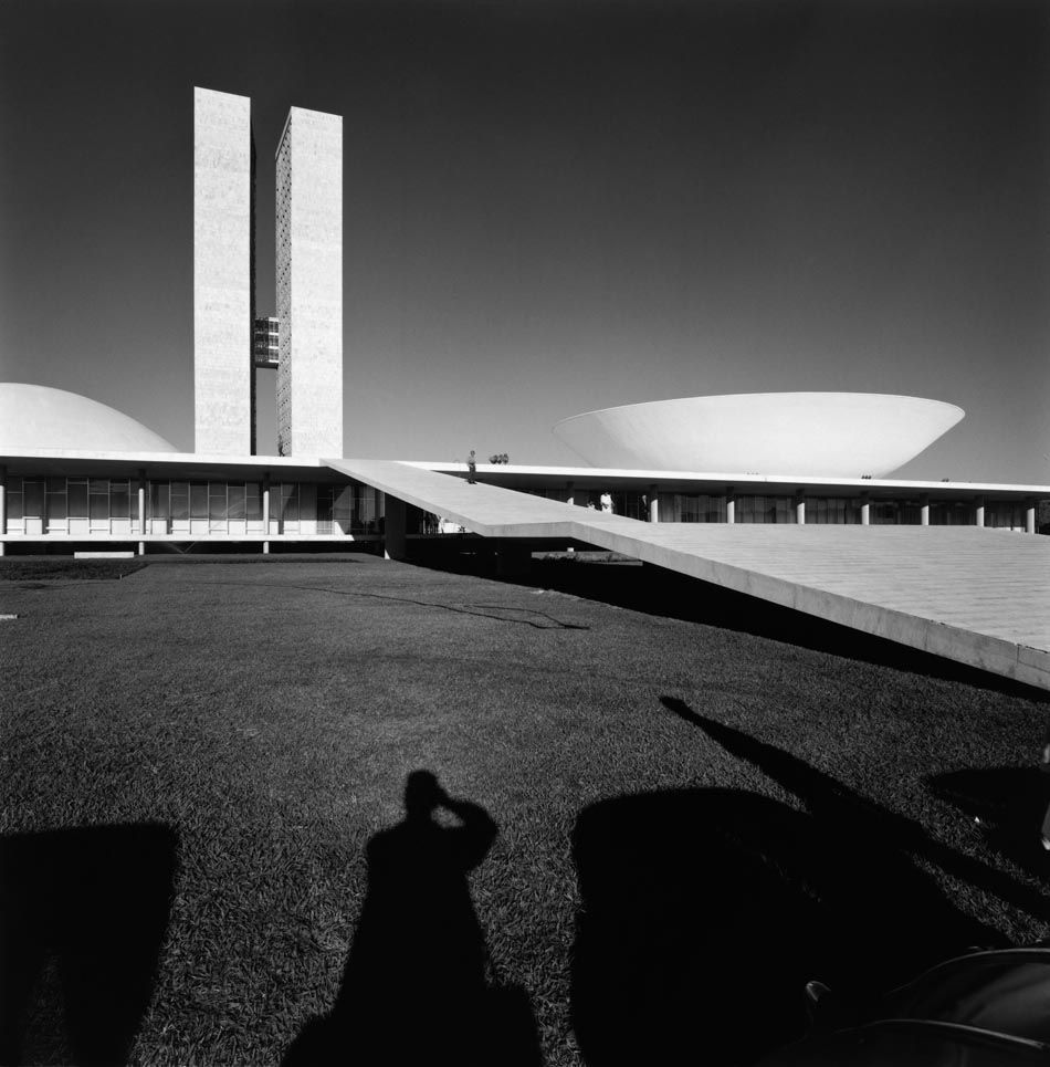
Brasilia was conceived of as a self-consciously modern city, one whose construction would herald the nation's leap into modernity and, as James Holston puts it in The Modernist City, to “create [a new age] by transforming Brazilian society.” Key to this rhetoric was a desire to embrace a distinctively rational model of city planning, one that would avoid what was seen as the unnecessary clutter of old-fashioned cities. Holston summarizes what Brasilia's city planners highlighted as the five “key functions” of urban life:
1) To organize the city into exclusive and homogenous zones of activity based on a predetermined typology of urban functions and building forms;
2) to concentrate the function of work in relation to dispersed dormitory settlements;
3) to institute a new type of residential architecture and organization;
4) to create a green city, a city in the park;
5) to impose a new system of traffic circulation.
Working back from these 'key functions'—the term itself used as a synonym for 'essence,' 'purity'—Brasilia's Plano Piloto resulted in the construction of a city lacking in the urban forms that have arisen organically for thousands of years: mixed use buildings, residential and commercial properties coexisting side by side, squares that were utilized as centers of social and commercial activity. Most jarringly, the master planners viewed corridor streets (or streets lined with continuous building facades) as messy remnants of an archaic culture and removed them entirely from the city's plan. By positioning themselves and their design as singularly modern, the city's master planner Lúcio Costa and the Kubitschek government were able to undermine any disagreement with the larger vision. Dissent was portrayed as anachronistic; aligning yourself against Brasilia was aligning yourself with an out-moded vision of the world, divorced from the city's pure purpose.

What resulted from these decisions is a city that is purported to be alienating in the extreme. As one resident put it to Rebecca Biron, author of City/Art: The Urban Scene in Latin America, “Everything in Brasilia was different. It was a shock, an illusion, because you didn't understand where people lived, or shopped, or worked, or socialized.” Brasilia is a city that “lacks crowds,” the “bustle of street life” and “human warmth.” To those “accustomed to an outdoor public...[the street's] elimination produced not just an interiorization of social encounters, but also a profound sense of social isolation. It is a place where 'even the tombstones are standardized.” There is a disorienting “sense of exposure residents experience inside the transparent glass facades of their Modernist apartment buildings,” a phenomenon people have responded to with individuality, putting up “every kind of visual barrier—curtains, blinds, potted plants, even birdcages.” The experience of moving to Brasilia was apparently so consistently traumatizing that residents of the city even created a term for this common feeling of estrangement—brasilite.

This would appear to be the danger of a design ethos that closes itself off to discussion—the creation of products that forget the needs of those who use them, a smoothing over of experience so profound as to be disorienting, a design toolkit that can begin to feel prefabricated and anesthetized. There are benefits to minimalism that are real to be sure—it replicates easily, it dates less immediately, it doesn't demand primacy—but by forgetting that the value of design comes not from a rigid adherence to core principles but from the people who use it, we're in danger of losing our ability to interact on a human scale. Design is at its best when it tosses asides truisms and embraces flexibility, when it retains its ability to surprise and delight, and when it embraces the challenge of pulling us out of the somnambulism of daily life and reminding us, at least for a minute, that imperfection is what makes us human, and interruption is what tells us we're alive.
But I actually kinda like Comic Sans, so what the hell do I know?