WHAT DO WE SEE WHEN WE GO TO AN ART MUSEUM?
| May 22, 2015
Roberta Smith wrote about a Van Gogh show that just opened at the Met. It is a typical formal art analysis, rhapsodizing about brushstrokes and paint handling—which is such a tiny part of what art is about in my opinion—though I do trust Roberta Smith sometimes. What I get from the article is that a key, essential element of these paintings is gone, faded, as Van Gogh used Geranium Lake, a synthetic red, to make his roses and pink backgrounds. This color has faded almost completely over the years—it’s been 100 years now—though the original colors are now resurrected in some photoshopped reproductions, which can be seen starting at the 4:30 mark in this video/slide show that she mentions.
Here’s a screen grab so you can see the before and after:
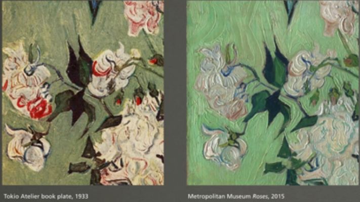
The difference is dramatic, no surprise, and it's clear that what survives is not at all what the artist intended. So what are we looking at?
It's not a big bit of news, but it's good to be reminded that nothing we see in art museums that is older than the last few decades bears much resemblance to what was intended by the artist. Can you imagine if that happened to books or to science? If it all slowly mutated into something quite different? No one would take the surviving skewed stuff seriously at all in those cases...but with paintings they do. We tend to accept what is in front of our eyes, trusting our deceiving subjective senses.
One can still find a lot in these paintings even if the visual and formal elements are unrecognizable—one can focus instead on what survives—his decision to paint flowers (rather than commissioned portraits or religious imagery, for example), the opening up of Japanese trade (it was a world exposition that brought Japanese prints to France and changed how almost all artists looked at things), the idea of retreating to the countryside—what did that mean? Why retreat and not engage? None of those are exclusively formal concerns and they apply even if the painting is changed beyond recognition.
Granted, Van Gogh was all about formal concerns and visual perception, painting almost identical vases of flowers on identical sized canvases points towards him focusing on formal concerns—the qualities, possibilities and variety of interpretation as subject. It almost didn't matter that they were flowers—except that flowers were a handy excuse to represent these perceptual phenomena. But anything would have done, really. He was passionately interested in visual perception—there were a number of color theories floating around at the time. But, as we see, we can't enter that discussion really, as those qualities in pretty much everything older than X years are gone.
Not only are the Van Goghs we see not what the artist intended, there are much more well known examples of this phenomenon. All those white marble statues in Italy and Greece and in museums all over the world?—not what they used to look like at all. (Those white colonaded buildings weren't all white either.)
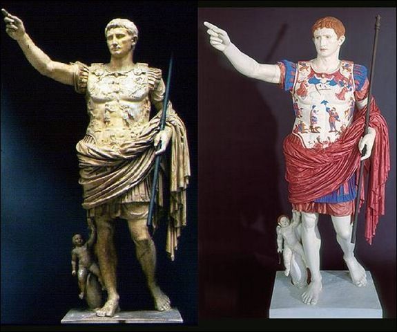
In my opinion, showing many of these works outside their temple contexts (many were religious objects) already removes a fair amount of meaning, but the conventional idea that they were all pristine and white—that's not right at all! I'd suggest that all the marbles, everywhere—in the Victoria and Albert, the Met, the Louvre—all be painted like these above, shown as they were originally meant to be seen—like bad waxworks! Otherwise, what are we looking at? Do we not honor the artist? As it is now, looking at these statues is like looking at a color painting in black and white, which is what they'll all fade to eventually...but we're not there yet.
What survives then, is not what the artist intended. We scoff at looking at art reproduced in books and postcards—but it seems the surviving postcards of Van Gogh's work gives a more accurate impression of what he did than what we are able to see now when looking at the "real things." Here are some postcards some made almost a century ago—that represent the Van Gogh paintings closer (in some aspects) to what he intended, less faded, more vibrant.
It's really hard to see these tiny postcard reproductions, but you can at least see how the color varies.
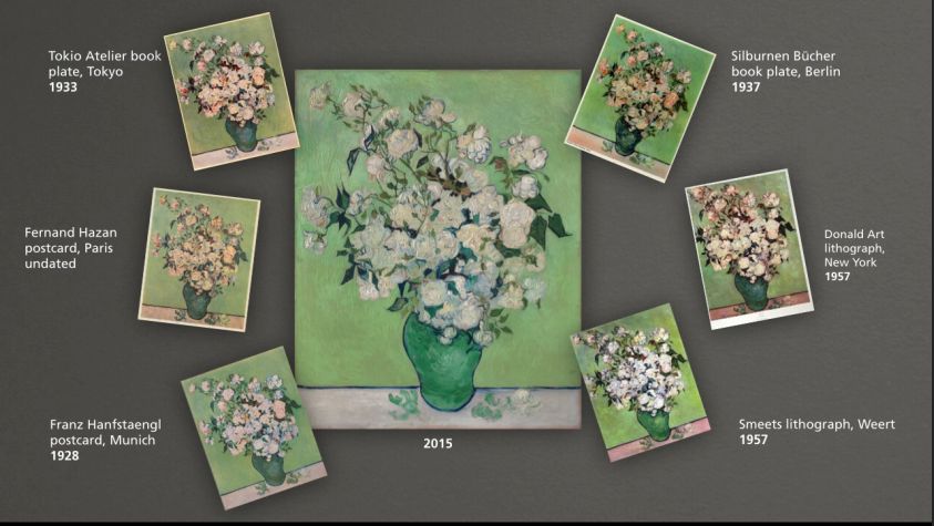
But, of course, the printing process skews the color of the paintings, too—but possibly less.
Of course, they're not the real paintings anymore.
But what are they?