
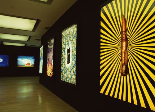
STAIRWAY TO HEAVEN
The vertical format sister to Better Living Through Chemistry. These lightboxes and posters combine clichéd graphic devices from contemporary advertisements with images of personal weaponry and paper money from various countries. Shown alongside the Better living series in Dallas, Trieste, Milan and Munich, they were also featured as posters in the Stockholm subway.
"STAIRWAY TO HEAVEN & BETTER LIVING THROUGH CHEMISTRY"
These photo pieces were made to be seen in public spaces.
One series, in horizontal format, is called "Better Living Through Chemistry" and consists of mostly stock landscape photos mixed with photos of drug paraphernalia and inspirational/motivational phrases. The other series, called "Stairway to Heaven", is vertical and combines images of cash and street weapons in various configurations with the addition of colorful graphic elements. This series was created in the exact format of bus shelter ads.
These works intentionally mimic and comment on the visual style of display ads, corporate graphics, trade shows, hip culture and motivational propaganda. I don't intend to make fun of these styles, although there is plenty of irony present in the work — for simply to make fun is a cheap shot and makes no attempt at understanding how images and words suck us in and inspire us to dream our noblest dreams.
I also don't intend to make a simple equation that, for instance, people use weapons to get money, although they do. I think that there's a lot more to it than that. I think people use weapons to exert personal power over other people. It's more about power and influence. It's not about a simple exchange of goods. It's about one group of people exerting power over another people, which is what images and advertising do. In a funny way, I'm saying that we like these things. Ads are seductive and we like them. We might intellectually say we don't, but we actually do. I'm sort of throwing out this idea that this is a part of us, something that's in the air these days, and maybe we should be aware of it.
I'm not giving a lecture, these are not didactic statements. They're a reflection of myself, and other people might see the same thing — they might see part of themselves in them.
These pieces, then, from my point of view, do not have a message. Messages, as Sam Goldwyn was reputed to have said, are for telegrams...and e-mail and faxes. I hope these pieces exist in that nether world where things are ambiguous, where they are neither here nor there, where their reason for existence is not clear. I believe they reflect strange congruencies and parallels in the world, but do not tell us exactly what to think about them. Ideally, they might act as a catalyst for some internal reaction or as a spark that might ignite some train of thought or feeling.
For me it is important that these images be as attractive as the advertising and promotions that they refer to. The seductive surface is part of the content. They are intended to be very pretty, a little confusing, a little ambiguous and somewhat dangerous and exciting, like all ads. And, like ads, their source is anonymous, the author's name is not present on the work. Ads are brought to us by Levi's, Gap, Calvin Klein, Snapple, Condé Nast, Warner Communications, G.E., Seimens, Exxon and others, but often the creator is invisible. This gives the work part of its power. The ads share their anonymous authorship with the Bible, the Koran, the Torah and Hallmark cards. The messages and images are received, not written. Our visual environment is also received, created by an anonymous "they".
I wish to be part of the "they." I want to be one of "them."
DB, SEPTEMBER 1996